Before/After: Cozy Bedroom Refresh
Our bedroom is the room I’ve put the least amount of design effort in since we moved in 2.5 years ago. I think the reasoning behind this is a sort of subconscious knowledge I had that every other room in the house (living, dining, kitchen, guest bedroom/office, bathroom, patio) is frequented by friends and fam who are visiting (although we haven't had visitors since pre-pandemic), whereas the bedroom is a space for only Eddie and I. It may not make much sense to some, but even though the bedroom is probably one of the most important rooms in a home, it’s been mostly put on the back-burner while we focus on spaces that our guests will feel cozy and comfortable in when visiting. Other than a recent dresser restyling sesh a few months back, we haven’t done much to the space. We’ve learned to live with the aspects of the room that bring us no joy - the broken blinds that come crashing down whenever we try to open and close them, the ugly flush mount light over our bed (aka the dreaded boob light), and our two dressers with busted drawers. We’ve procrastinated hanging curtains and kept using our old TV, even though it had a big dark patch in the middle of the screen from broken pixels. Not complaining as I know how privileged we are to call this space home and to have all the things that we do - but I’d be lying if I said I wasn’t very much craving a refresh, especially with so much time spent at home these past 6 months. The day finally came when I’d had enough, and decided to start working on the room for real! Wanted to share my process with you as well as my design choices and reasoning behind everything.
BEFORE
AFTER
DRESSER UPDATE
As far as functionality goes, first on the list to address was my dresser. The drawers were so broken I was really only able to use 1 of the 3. Which was, of course, a huge waste of space and an annoyance whenever I did attempt to open/close the busted drawers. It also didn’t make sense for Eddie and I to both have our own dresser in here as it made the room feel smaller, plus they were two different styles and didn’t really pair that nicely together. Eddie’s closet is in the office since I took both the closets in our bedroom (lol). We realized his dresser would actually fit perfectly in his closet, and he prefers having all of his clothes in the same place anyway - so in it went! This saved us a lot of space, and both of us were happy - a real win-win. I started searching for a new dresser for myself, which was probably the most time-consuming part of this whole process. Dressers can be very expensive depending where you buy from, and I was working on a limited budget. Ultimately, I ended up choosing this one because I love the design, it got good reviews, fit the space I had in mind perfectly, didn’t seem cheaply built, but was still reasonably priced at $363 compared to similar options I had found that were $1,200+.
BEFORE
AFTER
MIRROR MOVE
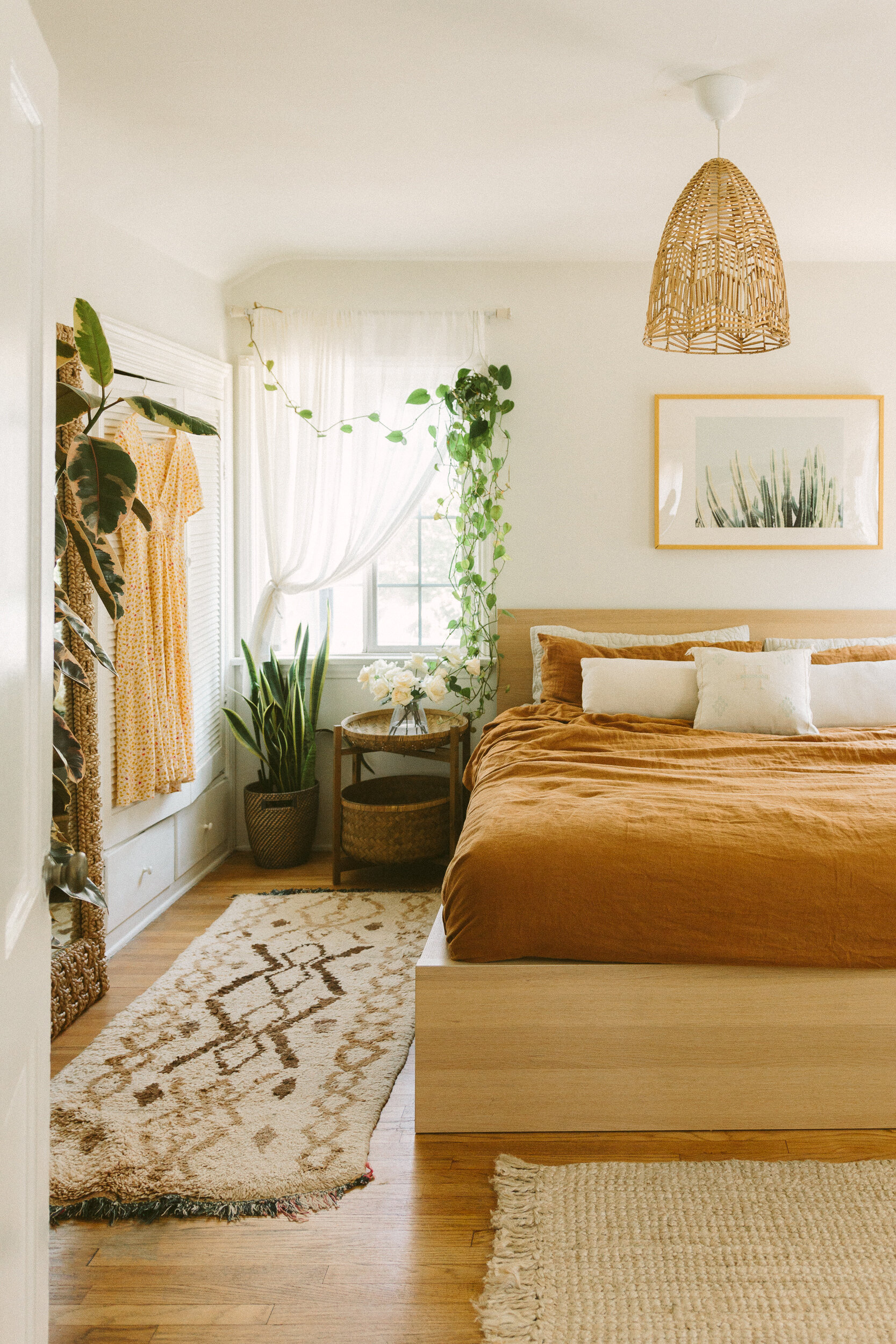
Once the old dressers were out of the room, I finally had space to move in our big full length mirror. It had been living in the office since we got it back in December, but I’d always wanted it in the bedroom. Moving it in here between my two closets means that I don’t have to walk back and forth between two rooms when putting together outfits! A small change that actually makes a big difference in my day-to-day.
mirror (similar here) / duvet / sheets / cactus silk pillow
FILLING SPACE WITH PLANTS
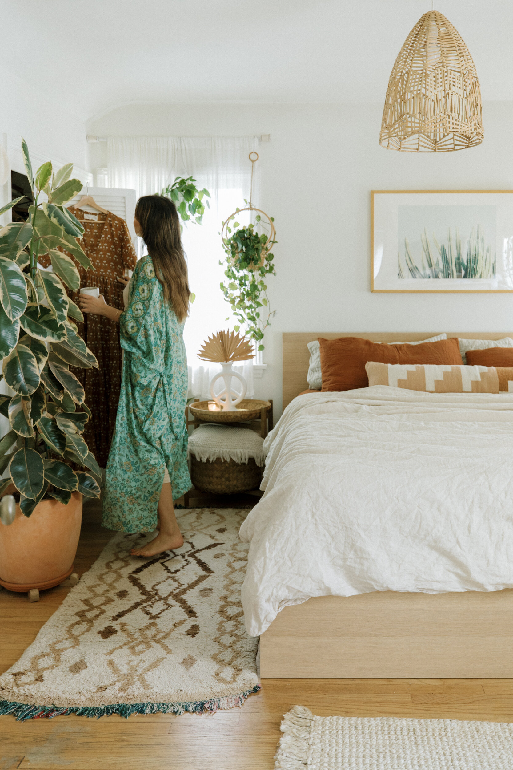
I went back and forth debating what I wanted to put next to the mirror. At first I thought I wanted a tall shelving unit next to it. But after giving it a lot of thought and being honest with myself, I ultimately decided that shelves would lead to me cluttering, and I wanted most items to be tucked away out of sight for a simplified space. I didn’t need the extra storage space shelves would provide, and they would really only serve as a display area for bags & trinkets. So I decided to ditch the shelf idea and instead fill the space with a plant. Obvi the better option, right?! I have two small variegated rubber trees and absolutely love the look of them. They’re relatively low maintenance and their watercolor-painting-style leaves just make me smile. I decided to start looking for a large one to fill the space. I went to all my favorite plant shops on the westside and was starting to worry I wouldn’t find the style, height, and shape I had my heart set on - and then the very last nursery I visited (shoutout to Marina del Rey Garden Center!) I found him. I picked up the perf terracotta planter to repot him in from La Belle Plant, and ordered some teak planter feet to save the hardwood floors from potential water damage. Voila!
My shirt/sweater/jumpsuit closet
my dress closet
TV CAMOUFLAGE
See that framed ocean print above the new dresser? Well guess what… that’s actually our new TV! I’ve been obsessed with the Samsung Frame since it was released a few years back, and after doing some saving decided to finally purchase it. They’re definitely an investment, but the cost was 100% worth it to us because we are o-b-s-e-s-s-e-d with this thing. Not only does it truly look like a work of art with that beige bezel, it’s also a super cool smart TV! No more big black hole on the wall!! You’re able to pick and customize the art you want to display, and you can set it up so that the art pops onto the screen whenever you walk in the room (and automatically turns off again when no movement is detected.) The colors and picture qual are top notch, and we’re able to access our Spectrum channels and all our streaming platforms simply through the TV’s apps - no Apple TV, Roku, cable box, etc required. There's only 1 wire attached and it’s so small you can’t even see it. It’s hiding behind the pothos on the left side of the dresser, and runs down to the outlet on the wall near the floor.
dresser (similar here, here, & here) / television
DRESSER STYLING
I really enjoyed putting this dresser top together. I wanted to have easy access to the things I reach for every day like my jewelry and perfumes, as well as my good vibes essentials - candles, crystals, and plants. I’m trying to keep this dresser sitch tidy, and tbh it’s easy when everything has its own little designated space.
hand / match striker / basket
DITCHING BLINDS FOR CURTAINS
Yowza, you don’t know how happy I am to be rid of the broken blinds! Eddie sleeps with an eye mask on and I honestly don’t like blackout curtains, so we picked the same pretty ivory sheer panels we have in the guest bedroom/office for in here as well. They make such a difference to the room, it feels a bit more dreamy and magic now. Especially when the windows are open and a breeze makes the curtains rustle. Ahhhh.
before
after
curtains / curtain rod / framed print / duvet
BYE BYE BOOB LIGHT
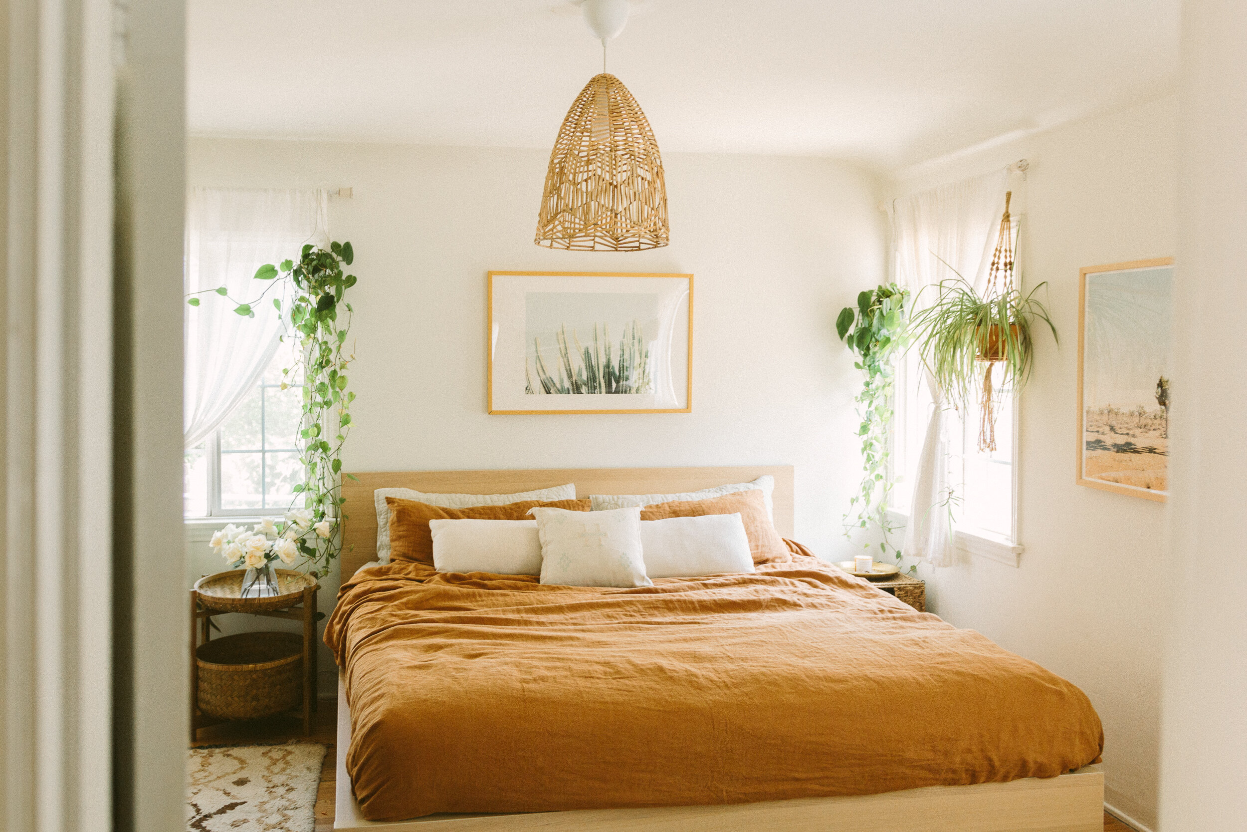
I wasn’t even aware these types of flush mounts are known as boob lights until a few IG followers clued me in, and now I’ll never call them anything else. Sooo funny! Anway, the boob light had to go. I’ve had this pendant tucked away in a closet for a year with the plan of swapping it in here eventually (my procrastination skills are unmatched y’all!) We finally hired a professional to install, and it literally brought the room to a whooooole new level. I’m obsessed!
before
after
Joshua Tree art / similar pendant light here / rug
And that’s the whole room! We’re honestly SO happy with the updated space, it really feels like our own special sanctuary now. It’s such a pleasure having movie nights in bed and waking up every morning to the beautiful sunlight streaming in. What do you think?! Let me know how you feel about the redesign in the comments below!
